Pre Production
I declare that the material contained in this assessment is the result of my own work and that due acknowledgement has been given in the bibliography and references to ALL published and unpublished sources. I confirm that I have reviewed the guidance on academic integrity at Academic Malpractice | MyCumbria to ensure that I understand the requirements.
Introduction To The Project (04/12/24)
This project is all going to be about the green light process. And to do that we're each going to create our own piece of pre production to then show at the end of the project, then we'll decide on which projects to green light. This project will act as the pre production phase for the final major project coming up in the next few months, so everything I do here needs to be done with production in mind. So that means that the idea is going to have to take scope and deadlines into account. Most of the pre production for this project will be done using Unity and will use free assets for kitbashing, as well as concepting. And by the end of this project there will need to be enough concepts and prototypes to make this project seem more appealing so this gets the green light.
This page will be dedicated to the pre production phase of the final major project, featuring idea generation, prototypes, concepts and also some research on the green light process, as well as pre production techniques.
Idea Generation (04/12/24)

Of course for this project I'll need a game idea. I've come up with three in total, two of these I'm familiar with and the last one is something new that may or may not work. The first idea is to make a survival horror game similar to Signalis (Humble Games, 2022). I've looked into this before for the game production project and it's something that I'm keen on trying. However I also came up with the idea of incorporating some eldritch horror creatures into this to mix things up a little bit. I feel like these creatures would work really well in this kind of game, with them being very uncanny and horrifying monstrosities.

My second idea isn't anything special. It's a HD-2D style game featuring some turn based combat. This basically the same concept to Octopath Traveler (Square Enix, 2018), but I'm doing this for a good reason. I've tried this style quite a bit and I feel like with one more attempt I can properly master the style. I know the short comings from the last project I tried this style on and I think I can correct them for this project.

Finally I came up with an absurd idea that, hopefully, will work. And that's to make a Gameboy game in the style of The Legend of Zelda: Link's Awakening (Nintendo, 1993). This can be done using GB Studio which is an open source game engine designed to make games for the Gameboy and Gameboy Colour. And using a flash cartridge I can run the game on real hardware. This would make for a really good challenge since I'm not familiar with the engine.

For my final Idea I've settled on making the HD-2D game. But with a bit of a twist. To start with the game is going to implement the eldritch horror creatures from my first idea. I really liked this and it means that this game can have a darker tone because of it. However I've looked into mixing up the HD-2D style a little bit. I was shown a game called Enigma of Fear (Dumativa, 2024) and I really like how it mixes up the style. It leans more towards the realism than Octopath Traveler (Square Enix, 2018) but still has the character sprites. This also means we can make some high quality models and textures, without needing to downscale anything.


As well the sprites are going to be comparable to Blasphemous (Team17, 2019). With my method of creating sprites it creates something that looks close to Blasphemous (Team17, 2019) with it having a bit more detail when compared to a traditional pixel art game. I'm also doing this since it's what I know and it's a proven method of creating pixel art.

I've also decided to change the combat slightly with it using similar combat to Final Fantasy VII (Square Enix, 1997). The difference between Final Fantasy VII (Square Enix, 1997) and more traditional turn based is that there is no set order for each character to attack. As soon as that characters timer hits 0 they can attack. It's still similar to more traditional turn based, but slightly different so it doesn't become generic.
The Green Light Process (06/12/24)
The green light process is a critical part of the gaming industry, some projects will go forward into production while other projects will gets scraped and not get developed. This can be for a few reasons and it mainly depends of the overall scale of the studio.

Some studios will need a big game for the studio to survive, Firewalk Studios developed a hero shooter game called Concord (Sony Interactive Entertainment, 2024) which was fully backed and funded by Sony Computer Entertainment. At the time of this project being green lit games such as Overwatch (Blizzard Entertainment, 2016) were really big and Sony wanted to capitalise on that trend. Concord (Sony Interactive Entertainment, 2024) cost both Firewalk Studios and Sony Computer Entertainment over $400 million to develop, the game needed to be a big success. Ultimately it wasn't and the game shut down services within a week of release. Firewalk Studios was also closed down due to this massive flop.

Some studios don't need a big hit to survive. A studio like Wayforward a fully content with making games that don't become massive successes. They've got successful games like the Shantae (Capcom, 2002) and River City Girls (Arc System Works, 2019) series which are popular but don't make the studio billions a year.

In addition to this a project can also be green lit based on if the project is a risk or not. A studio could develop a game that's really innovative but might not be a financial success. In most cases innovation can work, like with Metroid Prime (Nintendo, 2002). This game took the franchise and converted it into a 3D first person shooter, when normally it's a 2D side scrolling game. It was definitly a risk at the time with it changing so much in a 20 year old franchise. This did work out however with the fourth Metroid Prime (Nintendo, 2002) game coming out some time this year. But innovation might not always be viable. Game Freak survives exclusively on the success of Pokémon (Nintendo, 1996). They have experimented with different Pokémon (Nintendo, 1996) games like Pokémon Legends: Arceus (Nintendo, 2022), but these kind of games are normally made along side games of the main series. This isn't even the only example of this companies will do this quite a lot and it makes perfect sense. Pokémon (Nintendo, 1996) especially is still making so much money with the core series, so it makes sense for them to develop new main line games instead of something unique.

This also ties in with market demand. If customers a demanding for a sequel to a game then typically a sequel will get green lit over something new. There will always be a demand for a new Call of Duty (Activision, 2003) game the franchise is still selling really well so of course they'll be another one this year. If there isn't enough demand for a particular game then it's not worth making. Multiplayer shooters such as Suicide Squad: Kill The Justice League (Warner Bros. Games, 2024) are long gone and the release of this game proved that. People aren't interested in these kind of games anymore.

One successful game recently is Balatro (Playstack, 2024), It's been doing really well recently with it even being nominated for game of the year. This is a score based game where the player will play a poker hand and will earn a certain amount of points for that hand. The fun part is with the joker cards, with them giving unique effects. The most common effect being an additional multiplier to the players score. The main reason for this game doing so well is simply because it's fun. The concept is very simple but also really addicting. In addition to this the game has also recieved DLC in the form of collaborations. Cyberpunk 2077 (CD Projekt RED, 2020) is one of these collaborations and this draws in people who are a fan of this game in to playing Balatro (Playstack, 2024). The game also released at the perfect time also with it filling a gap in the market. It's a poker rouge like, which is an incredibly unique idea that doesn't exist else were in the market.

Earthbound 64 (Nintendo, Un-released) is a game that never made it to market. This was a game that was being developed for the Nintendo 64DD which was an attachment for the Nintendo 64 console. The Nintendo 64DD let developers develop games that had a much bigger file size for a better price. These disks we're 64 MB when the standard Nintendo 64 cartridges were only capable of 32 MB at the time. And while the idea was great, it took Nintendo so long to release this with it releasing in 1999 in Japan, 3 years after the base console. When it did release it was a commercial flop, with it only selling around 15,000 units in it's life span. Nintendo then created a 64 MB cartridge to compensate for the Nintendo 64DD no longer being supported. But With the failure of this, Earthbound 64 (Nintendo, Un-released) needed to move development of the game over to the base Nintendo 64 console. Which resulted in numerous technical difficulties. Along side of this the obscurity of the series outside of Japan made this project no longer financially viable so it was cancelled. This was until the first and second games we're remade for the Gameboy Advance. Which then green lit development for the third game to be made exclusively for the Gameboy Advance. This took the concept of Earthbound 64 (Nintendo, Un-released) and translated it over to the handheld. But since the first remakes didn't perform well in western markets the third game was released exclusively in Japan under it's Japanese title of Mother 3 (Nintendo, 2006).
To conclude the green lit process is essentially analysing the viability of a project in the current market. This could consist of sequels to games or even filling a gap in the market. But this all come down to the financial side of the industry were one game can kill a studio, like with Firewalk Studios.
Designing A Level For A 2D Platformer (11/12/24)

The idea of this is to make some level concepts for a 2D platformer game, with the mechanics of a dash and grappling hook ability. And that's all the information we're given, meaning it's up to us to concept everything else. In this case I've decided to keep this as simple as I could by not adding anything else. The theory behind this is that a lot can be done with very little. Pico 8 Celeste (Extremely OK Games, 2015) uses this really well, It's a basic platformer with the player only being able to jump and dash. However with how the levels are designed it becomes a really effective game.


With my designs I've decided to make a precision platforming level using Pico 8 Celeste (Extremely OK Games, 2015) as insperation. For the first level the player will mainly be in the air since there's not many places for the player to stand. The player will use a combination of the dash ability and the grapple to reach high up places. My idea for this is that the grapple hook would be limited in some way, this could be something like a timer or a limited number of uses. I've also added a little collectable in the bottom right of the level to encourage the player to test there skills. This is something Pico 8 Celeste (Extremely OK Games, 2015) does with the strawberry collectables with them typically being in hard to reach places.
The second level I don't think is as good as the first. This one is a bit more direct, which isn't great since that doesn't give the player the chance to work out how to complete the level. The player needs to have that trial and error feeling when playing, otherwise they wouldn't feel that sense of achievement. While the levels are straight forward with there only being one set path, there needs to be a place that is hard to reach but the player knows is possible to reach. That encourages that trial and error. I could see this level being an auto scrolling level where the camera is constantly moving up and player needs to keep up the pace. It would be a little more effective in that style of level.
Another thing I tried to do for both of these levels is keeping the entire level viable on the screen. This helps to communicate to the player that there is a path to the exit they just need to figure out how to get through it. There's nothing worse than having a precision platformer that is incredibly long and brutal. While that can work it's something that would frustrate the player and, most likely, make the player stop playing.
While this isn't going to be the idea I use moving forward it's a great exercise in level creation as a whole. Especially for me where I typically don't make paper prototypes. It's given me practice in how to effectively make a level based on the mechanics of the game. I'll keep this in mind for when I eventually make level concepts for my game.
How Disneyland Has Influenced Open World Games (11/12/24)

This may come across as a bit of a surprise but Disneyland (The Walt Disney Company, 2025) has a really interesting layout to it's parks. The main idea around this layout is that everything will surround a main central area. It achieves this with the iconic castle directly in the centre of the park, with everything else surrounding it. This way it creates a natural way point to anyone who wants to go to the different areas. While yes it's possible to go to each area without moving to the centre, however it's still something that can be used for navigating the park. In a situation where a guest is lost all they've got to do is walk towards the castle to return to the centre point.
But how does this relate to games? And to put it simply many games will use a layout comparable to that of Disneyland (The Walt Disney Company, 2025). Quite a lot of game that have multiple biomes and areas will typically have a centre point that the player constantly returns to, It's become such an integral part of open world games that most players probably don't even know that they're being guided.


Elden Ring (Bandai Namco, 2022) is a great example of this methodology in use. One thing that is constant through out the game is the giant Erdtree. It's constantly in view and it acts like a massive way point for the player to go towards. And what is even better is that the final objective of the game is to go to the Erdtree. So through out the entire game you're constantly reminded of your end objective. Additionally, it's map is designed in a way were it's a linear path. It might not feel like it's linear but it is. The player can only go in one direction to actually progress the game. There's only a few areas that deviate from the main path like Caelid, but even then the player still needs to return to the main path to progress. Elden Ring (Bandai Namco, 2022) achieves this by forcing the player to move through one area before going to another. For example the player needs to go Liurnia of the lakes before they can go to the Atlus Plateau. This is fully intentional since it filters the player into a fixed location. It's forcing the player to encounter certain boss fights before a new area is unlocked.


Another great example of Disneylands (The Walt Disney Company, 2025) influence is with The Legend of Zelda: Breath of the Wild (Nintendo, 2017). Just like Elden Ring (Bandai Namco, 2022) this game has a big central point with Hyrule Castle. And it's also visible from most areas of the game. But one thing the this does differently is with the Divine Beasts. These act as the main objects of The Legend of Zelda: Breath of the Wild (Nintendo, 2017), with the player being tasked with activating them all before the final fight. But what makes these special is these are in each major corner of the game. And the main one of interest is the Hebra Divine Beast. The player can see this flying around the area pretty much at the start of the game. And this encourages the player to go in that direction, simply because of the players curiosity. Not only does this teach the player what they have to do, but the completion of a Divine Beast reminds the player of the end goal. The player is shown directly where the objective is and it also shows a red laser pointing directly at Hyrule Castle further reinforcing this. Also with how the world has been designed the player needs to return to the centre point before they can move over to the next area, creating a clear outline of where each biome starts and ends.
Refining The Initial Idea (11/12/24)


Before moving on my initial idea needs a little bit of refining. It also needs some refining since I'm not working on my own now. Adam, Erica and Jac have joined the project and they'll be assisting with getting this project green lit. And we've started off by gathering reference on the theme of the project.
The overall theme of the project wasn't clear initially. So we've looked into some of my favourite fantasy worlds and I settled on the dark fantasy tone that Berserk (Kentaro Miura, 1989) has. It's incredibly dark and gory, so the overall theme should fit in well with the eldritch horror aspect of this game. Berserk (Kentaro Miura, 1989) also features similar creatures that we could have a look at for insperation. Everyone on the project really liked this idea so I'm confident that it's the right call. In addition to Berserk (Kentaro Miura, 1989) we've also looked at both of the Octopath Traveler (Square Enix, 2018) games. It's got the HD-2D style but it's also got some creatures that would fit in well with this idea. We've also looked into some of the creatures from the Eldritch Horror (Fantasy Flight Games, 2013) board game to get insperation on the kind of creature we're after. We seem to like creature with long limbs that are kind of humanoid.
Finally, I've changed the initial idea of Final Fantasy VII (Square Enix, 1997) combat to something a bit more traditional. Just like Octopath Traveler (Square Enix, 2018) with it having the standard turn system. One thing I do have planned is having the enemies appear in the world as opposed to them being random encounters. This way the player would be able to see if they're engaging in a fight instead of it just happening at random.
Level Concepts (08/01/25)

Bloodborne (Sony Interactive Entertainment, 2015) has a really interesting layout to it's levels. It's really condensed with everything feeling closer than it really is. But one thing that makes this unique is with it's hidden shortcuts that the player can take. With Bloodborne (Sony Interactive Entertainment, 2015) the player is going to die quite often, and since there's only one lamp in the area, it's hard for the player to feel like they've made progress. So with this game there are shortcuts that the player can open once they've progressed far enough. This way the player can feel like they've made progress despite them starting back at the beginning.


So with my level designs I'm going to use that concept of short cuts with my designs. With the first one I tried to keep it fairly simple. There's only one set path with a side path that leads to an optional boss fight. The main reason for the boss fight is to encourage exploration. With Bloodborne (Sony Interactive Entertainment, 2015) if the player encounters an optional boss fight It's a fitting reward since it'll give the player some blood echoes and useful items. I wanted to try and replicate that with a little optional fight of my own. I'm rewarding the player with pain.
One thing that I though would needs adding is more optional paths and short cuts. The optional boss fight doesn't have a quick path for the player to take which would lead to frustration. So with the second draft I've condensed the level down and added some additional short cuts for the player to take. Hopefully this helps to minimise the frustration. I've also added another side path since there was only one last time.
Finally I received some feedback from both Erica and Adam, and the main thing that was brough up was with the level being a bit long. It's quite big and it might take quite a while for the player to progress. Another thing is that I should have shown where enemies are. This is something I was thinking about, but with this style of game we could make it into random encounters. Similar to how Octopath Traveler (Square Enix, 2018) handles it's fights with them not showing in the overworld.
Concepting (08/01/25)


Since this project is going for the gothic architecture it's a perfect opportunity to dust off some old models I made. I started off a side project about a year ago and it never got finished. It was going to be an Unreal Engine 5 render with a cathedral, but I had to stop working on it when the course started it's second year. But I kept everything from the project for a situation like this. I've got two models a metal fence, and a unfinished crucifix model. I'm going to quickly render these into pixel art to see what they look like.


They both look quite good, especially the fence, but with the crucifix It needs more detail. It's good some really good lighting just no materials to make it look like anything. Thankfully this is just for a test and they aren't going to be used for the final game.

Finally I've made a quick test scene, reusing some assets from my Bloodreign project. And I think that the fence in particular looks really nice with the grass. It fits the overall theme quite well. The crucifixes look out of place, which makes sense since they aren't final. However for a test I think this works quite well. I'll continue to test out some elements with the style, followed by some gameplay prototypes.
Level Mapping (15/01/25)


Before I actually block out my level I need to make a quick path so I can test out the length of the level. I've taken the starting part of my map concept and I've used the tile map to draw it out in engine. However this first test didn't go great. A combination of the player speed and the long design meant that this wasn't going to work. It took so long to get across, so I increased the player speed. And it helped a little bit but it introduced a problem with the colliders not working as colliders. So before I progress I'm going to quickly fix this.

The fix here is to simply reuse the master script from the Bloodreign version of the player. The one I was using was from the 2D animation project which was made in less than an hour and was broken. This time not only are the animations going to look nicer but it's also going to mean that the collider issue will be fixed. This script uses a Rigidbody for the movement and not a Transform.translate. It's going to feel more consistent and I can increase the speed as much as I want.

In addition to that fix I've also shortened the length of the test level. Hopefully the shorter level design and the increased player speed makes this better to play.
With them fixes the level now only take around 40 seconds to fully move through. It feels much nicer to play and with some enemies in the way it should make for a good level to play through.
Reference board (22/01/25)

This board will serve two purposes. First off it will act as a style guide for how I would like the game to look, gothic architecture in the HD-2D style. And second this can act as a guide for level deign. There are three games that I'm using in total, Octopath Traveler (Square Enix, 2018) along with it's sequel Octopath Traveler II (Square Enix, 2023), as well as Bloodborne (Sony Interactive Entertainment, 2015). Bloodborne (Sony Interactive Entertainment, 2015) is being used as reference for the dark gothic style and both Octopath Traveler (Square Enix, 2018) games are being used as level design reference, as well reference for the HD-2D style.
Grey Boxing A Part Of The Concept Map (22/01/25)

The first thing that I need to do is create some very quick assets to make the grey box. These assets only took around 20 minutes to make in total, since the quality of these assets don't really matter these need to be made quickly so it doesn't waste time. Every assets is also made in the same scale as the player, which is 3 Unity units tall. To make sure I had the correct scale I simply made a cube the same height as the player and exported that cube into Maya. Finally I've also made some assets for some miscellaneous street props, things like lamp post and boxes.


To make this process even quicker I'm simply going to outline the excising path with the building props. The path is what I had previously mapped out so I know that this path isn't too long for the player. I've also made sure to leave the bottom of the path open with no buildings. This is so the camera doesn't clip into any of the buildings.


After the buildings were placed I started to decorate the streets a little bit with some of the props. The lamps give a nice look to the level and I could potentially use a similar method for the final map. Additionally I've placed some boxes and barrels around the block out also. There where some gaps between the buildings that the player could go through and these boxes work to block the player from accessing these gaps.

Another thing that needs doing is added some colliders to the front parts of the path. Buildings can't go here because the camera needs to be in this area, so a collider needs to go here to stop the player from wandering off.

Finally I need to correct an issue with the player. In my past project Bloodreign the player had an issue with getting stuck into the ground. I now know that this issue was caused by the tile map floor that I used. And since this test project uses the same player from that project the issue has carried over. My fix to this issue is to simply use a terrain object as a floor instead of tile map models. This corrects the issue with on down side. That being that I don't know how to fully use it. I normally just use a plane object to achieve the same thing so I'm not familiar with how this works. I'll look into this at a later date.
Giving to level a quick test and everything seems to be working just fine. Of course it doesn't look any good visually but it's functional. Next I'll be working on adding some more elements to this grey box mainly with a sewer element.
Sewer Grey Boxing (28/01/25)


One thing I mapped out in my concept was a sewer element that would act as a short cut for the player to take. So started out by outlining roughly where I wanted the sewer to be and worked on blocking it into the level. The terrain floor can't be used for this since it would simply cover the gap that I'm trying to make. So I've had to turn back to using models for the floor, but this time there's only a few models being used, as opposed to the hundred that tile map would have used.

With that done I worked on barricading the player using the fence sprites I made prior. They're going to be used as a place holder for the time being


With the sewer cutting through part of the street there needs to be a bridge so the player can get to through this part of the map. For this I've reused an old model which should work out nicely for this. Following that I continued to place some more fences to stop the player from falling into the sewer.

To finish off I started to experiment with some plane objects to block some of the light. At first I was a bit too aggressive with it cover most of the level, I've since decided to cover less of the level in shadow so it's visible.
The level worked really nicely in testing. It played just like before just with an added element of the sewer. It a level of verticality to the map without doing too much. And in doing this I've learned what I'll have to do to construct my levels in production. I'll have to use 3D models to construct everything very similarly to what I did prior with the tile map. However, this time I'll be using bigger pieces and not using the tile map. This will hopefully decrease any performance issues since they'll be less meshes to render. Additionally, I'll be using a single collider to cover multiple objects, instead of each object having a collider. Again this will decrease any performance impact as well as prevent the issue with the player getting stuck in between the colliders. Next my focus will be turning to the visuals of the project, involving some experimentation with the art style.
Colour Palette (29/01/25)

Before I do any experimentation with the art style I need a colour palette to follow. I've kept it incredibly simple with it only being 3 main colours. Red for blood and also for some highlights, Orange for fire and potentially for a sky similar to Bloodborne (Sony Interactive Entertainment, 2015) and finally a slightly blue grey as the primary colour of the game. As you can see I've taken a very similar colour palette to that of Bloodborne (Sony Interactive Entertainment, 2015), which is fully intentional. My game is very similar in theming so the colour palette will work really nicely for this game. They'll also be some element that are coloured differently, these are just the palette that I would like most of the game to follow.
Creating An Enigma Of Fear Style Of Scene (01/02/25)

I'm going to experiment with a different art style than I've done prior. And that's the style of Enigma of Fear (Dumativa, 2024). It's a very unique spin on the HD-2D style that Octopath Traveler (Square Enix, 2018) started. What this game does differently is maintain high resolution textures on it's 3D models. Instead of blend between pixel art and 3D models that the HD-2D style has. And while no other elements in Enigma of Fear (Dumativa, 2024) are pixel art (other than the characters) it does a really good job at making the sprites blend into the 3D scene like they're meant to be there. The dynamic lighting is really what blends the two together, with each sprite having edge lighting based on the lighting. While I'm not sure on how this works I'll be looking into this at a later date. One thing that will change to better suit my game is the perspective. Enigma of Fear (Dumativa, 2024) uses an isometric perspective while mine will stick with a side perspective. However the style should still be able to carry over nicely.

While I could simply use the same sprites I normally use I though it'll be best to quickly render a new sprite in an isometric perspective. Before it could be used however I needed to modify the model a little bit to work better in this perspective. The main fixes were with the scythe, it needs to be in line with the feet of the sprite. If it's too high it'll clip into the floor and I don't want that. I've also decreased the resolution slightly to better fit with the Enigma of Fear (Dumativa, 2024) style. It's not quite as clean looking as the game but it should work for this test.

I also corrected the sprite in Aseprite to correct the hair. Before it had quite a few gaps and it didn't really look nice.


I'm going to be using some assets that I found on SketchFab. These should look nice in the scene, and should help to mimic the style. And it's also saving me quite a lot of time.

Since the cathedral model doesn't have a door I've the dungeon door model instead. And I think it blends in with the style quite nicely. I just need to apply the materials to both of the models so they're not grey.


With the main model in place I start and focus on the composition of the shot. Mainly with the camera perspective, I never done an isometric camera view before this is going to take some trial and error. After I got a decent camera angle I worked on placing some grass into the scene. These are the exact same asset I've been using for quite a while just at a higher resolution so they don't look like pixel art.


More assets found on both SketchFab and the Unity Asset Store. These are going to be used as props for the scene.


I'm going to be using both the lantern and the fire together to get a more stylised fire effect. I've also modified the fire effect to give it a more darker red look and to scale down the size of the effect. It looks much more stylised this way and I think it looks a little nicer. I've also added a point light so it looks like the effect is lighting the area around it.

However one problem is that the light doesn't look like it's coming from the fire. Fire lighting normally flickers and this isn't. So to fix this I've made a simple flickering script. This will change the intensity of the lighting every time the coroutine triggers. It should work out nicely.

I've set the minimum light intensity and the max to 25, with the coroutine triggering every 0.1 seconds. And it's looking nice it looks more like it's coming from the fire now than it did before. I'll definitly be keeping this ready for production.

To enclose the area a little bit I've duplicated the cathedral and placed it to the left of the shot. Now it looks much better. I've also changed the composition slightly so it's closer to the sprite and the door.

Finally I've applied the same post processing effects from the block out scene. However it needs adjusting for this scene specifically, first off everything was purple and the entire scene looked like a light show. These were caused by the hue shift and the bloom. The easiest fix is to simply remove the hue shift and increase the bloom threshold, now it actually look how it should. I've also adjusted the exposure slightly since the hue shift is gone.

And here is the final scene. It does look relatively close to Enigma of Fear (Dumativa, 2024) with a few exceptions. First off the bloom might be a bit too high for this style, it takes over a little bit and makes the fire hard to see. Secondly is with the sprite, It's too high resolution and doesn't look as clean as the game. This isn't a big deal but this is something I can look into later. And finally the sprite doesn't have the edge lighting that Enigma of Fear (Dumativa, 2024) has. This will be the next thing that I look into since it's a crucial part of the style. And I think that should make this look even better.
Peer Feedback (05/02/25)
After receiving some feedback from both Alex and Skye, a few issues have been noted. Firstly, my grey box needs some refining. It's a little unclear and really hard to see what it's trying to represent. This is mainly because of the overall design of my models, with them not matching the overall style I'm going for. I'll create some new models that more closely match what I'm wanting soon. Secondly, the camera clipping really needs correcting. The plan is to create either a custom shader or a script to correct this issue, but that will mostly be made towards the end of this project. Lastly, there's an issue with the chosen colour palette on my render. It doesn't really match what I had planned out before with it primarily being red and green. And green isn't even part of the colour palette. I plan on making a new render that should not only better show the overall theming but also the colour palette that I've got planned.
However there are some positives with what I currently have. First off, reusing the player from my previous projects was a smart move. Not only does it showcase roughly how I want the player to move about, it was also incredibly easy to implement since I've already made the character. This will be the fourth time I've used this character and it's still working well, even a year later. In addition to that the level looks fun and interesting to run through. Even though the theme is unclear it still look appealing. Finally, despite the colour palette issues it still show the wanted art style quite well. It shows the high detailed models blended together with the sprite really well and it's a good proof of concept.
Next I'll be creating a new render to address both the colour palette issues and to better show the overall theme of the game.
Creating A Battle Scene Render (07/02/25)

The objective of this render is to better demonstrate my overall idea for the style of the project. While also focusing one what I had planned out for the colour palette for my project. I'm going to achieve this while also planning out how I would like the battles to look like. So I've looked into both of the Octopath Traveler (Square Enix, 2018) games specifically at the battle scenes.


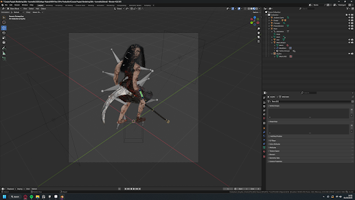
To start I'm going to need a good battle stance pose. For this I opened the Blender file for the attack pixel art rendering and positioned the camera. I've positioned the camera in the exact same way as what I did with the last render I did. An isometric top down perspective.

This sprite needed quite a lot of correcting. Not only was the hair a complete mess but the face was also completely removed. So I had to redraw the entire face and also smooth out the hair.

To save on time I'll be using this town scene that I had found on SketchFab. It's similar to what I want my game to look like and it should work out nicely for this scene. And it's also going to save quite a lot of time.

With the town in Unity I tried to position the player sprite in a good location to where it would be visable to a player. I started by trying to position the player to the right side of the screen similar to Octopath. However I realised that this would work out much better with the player to the left of the screen. English readers read from left to right, while in Japan they read from right to left. And this also carries over to any piece of visual art work, not just literature. So English players will look from the left of the screen to the right. With this I want to leverage what most players would look at first, in this case the players character. So I've positioned the camera to mainly favour the player and I really like the camera angle. However the player sprite doesn't really fit with this style, so I'll have to make another.


I created a new sprite this time with the camera behind the model. This should look much nicer in the scene with the new camera angle. The sprite also needed correcting slightly, again, with the hair.

One problem with the isometric sprites is with the foot placement. One foot is raised in the air which makes for some really weird looking shadows. To fix this I've simply duplicated the sprite and changed the Mask Interaction to Visible Inside Mask, this blacks out the entire sprite making it look like a shadow. I've also turned off render shadows on the main sprite so there's not an additional shadow.

For an enemy I've decided on using the boss character I made for a previous project. It should work out nicely and the sprite doesn't need any corrections which it great.

I added the enemy sprite into the scene and it's looking good. The only exception is that the lighting is far too dim. So it needs some lighting.

The town does have some lamp posts already in the scene, they're just incredibly boring looking. So I'll be replacing them with these which should look good in the scene but also more closely match the theme I'm going for.

To actually use these lamp posts I've added some point lights to them, and I've set the colour of the light to more closely match the colour palette. I've got the grey and the red I'm just missing out on the orange. This is a little bit of a lighter orange than was planned but it does work out really nice in the scene. And it's still close.


This is the point where I start and decorate the scene with some miscellaneous items and I've started off with some simple boxes. Which are just the boxes from Snakientist just with the red cross removed from them. They fit into the scene quite well and it works to fill in the empty space.

Another thing I've added is the blood texture that Adam made in the last project. It's a really nice looking texture that works quite well. I added the texture to a plane object by creating a lit material out of it. This makes it blend much better into the scene.


Finally I want to try and mimic the edge lighting that Enigma of Fear (Dumativa, 2024) has. I've done this by creating a modified version of the HD-2D Shader that supports emissive. Then by duplicating the sprite and adding this shader it give it a glow across the entire sprite. After that it's just a matter of aliening the sprite to mimic that edge lighting.

With all of that done, and with some post processing added, the render is done. And I really like how it's turned out, minus the edge lighting. I tried to mimic the look it didn't work out here. My theory to how Enigma of Fear (Dumativa, 2024) did this is by having a dedicated edge lighting sprite on each character that would change the colour of the emissive by the light hitting it. This will be the next thing that I look into as it's a crucial part of the style that I want to replicate.
Experimenting With Edge Lighting (08/02/25)

While I don't think this is how Enigma of Fear (Dumativa, 2024) achieved it's lighting, it's still a good experiment into how I could potentially light my sprites. It's also important to note that I have experimented with these in the past with no success. The sprites either looked weird with them on or it didn't make a difference. I'm hoping that this way I can create a normal map that's actually useable. In researching this I found a Reddit post that linked to this GitHub page. It's a very simple LUA script for Aseprite that will generate normal maps exclusively for the edges of a sprite. This is exactly what I've been wanting so it should work well.

I've never actually added an additional script to Aseprite so this was way harder than it should have been. The scripts folder is buries in the AppData folder from the User directory. Thankfully my hidden files are set to always be shown so I was able to find it just not without some struggles. I couldn't even find any information on this online I needed to go into each Aseprite folder I knew of to try and find it. Anyways, once the folder is found the script just needs to be added into that folder and it should appear in the Aseprite scripts tab.


As an experiment I'll be using my run sprite sheets to generate a normal map for each of them. It's actually incredibly simple to generate them all I need to do is run the script and that's it. Each map looks like it'll work well there's just a little issue with the hair, but that isn't anything new. It's also create the normal for the edges exclusively which is exactly what I was needing.

Adding the normal map for 2D lighting is really easy. All that needs to be done is to add the normal map onto the sprite sheet as a secondary texture. Which will work perfectly fine for 2D lighting. But this is a 3D game using a custom shader. So the shader will need to be modified to be able to use the normal maps.


The first thing that needs to be added to the shader is a reference to the normal map. Thankfully it's really simple to do in shader graph, I've just got to look for any map called _NormalMap. Which is already applied onto the sprite sheet. Then I've got to add that found normal map to a Normal From Texture node and connect that onto the normal part of the shader.

And to my surprise it's working really well. On the right side is the sprite without the normal map and on the left is with the normal map. It looks really close to Enigma of Fear (Dumativa, 2024) and it looks really nice.


Following the success of this experiment, I worked on importing the bat enemy from BloodReign into my block out scene. I even generated a normal map for it's sprite sheets to add the new lighting. And it didn't look right. Something was off as it had some really weird dark patches on it. So to see if the normal map was being an issue I added the normal map onto the emissive channel to see the issue. And as you can see it clearly doesn't look like the normal map. It's completely broken.


The fix for this was to use a Sample Texture 2D node instead of a Normal From Texture node. This work exactly how it should with it looking much better. I thought I would have needed to use a normal from texture considering the normal map was a texture, but I'm assuming this node is probably to make quick normal maps if one isn't available.

The effect now is much more subtle but it's not broken. This is could also be because of the high resolution of the sprites pixel art. This sprite is 192 by 192 pixels which is almost double what most pixel art would look like.
I also tested the lighting on the bats and it looks quite good. With the more simplistic style of the bats that lighting works much better than it does on the player. But it's still noticeable.

Finally to properly test out this method of edge lighting. I'm going to generate some normal maps for both of the sprites in the battle scene. This was I can properly test out this method with more direct lighting.


The normal maps generate mostly fine except from the players sprite with the hair being an issue again. So I quickly corrected the sprite before exporting them.

With them implemented into the scene the sprites look much more natural in the scene. The lighting is working great and far prefer this over what I did prior. However one thing I need to test out is with mirroring the Y Axis when generating the normal maps. This way the green channel of the normal map would be at the back of the sprite. It could look better this way but I'll have to test it. Overall though I'll definitly be using this method moving forward.
Testing Normal Maps With No Y-Axis Mirroring (09/02/25)

When I generate a normal map in Aseprite it applies Y-axis mirroring by default. I left this on since I was just experimenting. Now I've realised what this setting actually does. The lighting should be more prevalent on the back side of my sprites and not the front, this is exactly what mirroring does. With mirroring disabled it applies the green channel to the back of the sprite where I want it. This way most of the light will influence the back with the red appearing darker.

The difference is obvious with this new normal map. The back of the sprite is now much brighter and gives a really nice look. However there's one problem.

The normal map generates it's map around the edges of the sprite. So effectively it covers the edge of the sprite. For this sprite it's a problem since the left eye gets covered in a shadow. I can add a light to brighten that part, which I did, but that's not really the best solution to the problem.


The better solution to this problem is to manually edit the normal map so it doesn't effect the eyes. Thankfully the normal map is generated on a new layer, so I can lower the opacity of the normal map to see what I'm working on. All I did was remove the red outline on the map and replaced it with the basic light blue, now it shouldn't be effected by the lighting.

With that fix done this sprite looks much better. It looks more like it's part of the world much more than it did before. I also generated a new normal map for the player but it didn't create as much of a difference. It's just a little bit darker on the hair but that's it. I'll definitly keep this in mind for any other maps I generate, any sprite that's facing to the right needs to have Y-Axis mirroring disabled.
Seminar Reflection (12/02/25)

The intention of this seminar is to show our work to everyone to receive feedback on our projects so far. And was mainly involving our level block outs but I decided to also show the more art focused parts of my project, with the renders. This was a little different from our usual seminars since it acted more like an informal presentation. I feel like it went quite well with me being more relaxed than with most presentations I've done prior. I kept it quick and to the point, with me spending quite a bit of time on the visuals and the mechanics.
Feedback
In terms of feedback, most of it comes from the level. First off the dreaded camera clipping was brought up again. I really need to get this fixed, but not right now. There are more important things that need prototyping right now and something like this can be addressed in production; which it will be. Secondly, it was mentioned that I could include pre made assets as opposed to the quick blocks that I have. And while I could do this, with the assets from the battle scene, it's a matter of time. That will be a very time intensive task and since the project is coming to an end, this is something that could be explored at a later date. However, if I find the time I will be exploring this idea. In addition, having destructible items to open side paths and secrets would be a very interesting mechanic it include. I think this came about with the boxes and barrels that I had in between some buildings. This would be great inclusion as it stops the level from feeling too much like a linear path. The only thing that was mentioned about my renders is that there could have been some environmental story telling that was included. This could be something like dead bodies or something more sinister like an iron maiden. I really like this idea and I think it'll be a great addition. Just not right now.
With what I did well the lighting was a really good strong point. Mainly with my last render and I can definitly see why. It looks like a lit up village in the middle of the night. This level of lighting has come from me experimenting with it for quite a while in other projects, so it's good to see that there is some improvement. A long side of that the sinister tone was also mentioned as being a positive. The dark tone mixed with the limited colour palette gives a nice theme. For the level block out a positive was with the overall lay out of the level. It's not just a straight path and it also was points that break it up a little bit. One point of this would be with the bridge, with it feeling like an entirely new section as opposed to it just being a simple path. I'll definitly be including more of these points in my level design since it makes the overall level feel much nicer to play.
Thoughts on the others projects
To start with Skye's is looking really interesting. She showed a block out with an animated camera fly in and it's composed really well. The air ship a clear focal point with the buildings being placed either side of it. The only negative I could find with this is with the centre of the block out being too narrow. This gap could be widened to further show the air ship. Similar to the start of BioShock Infinite (2K, 2013) where the player is shown the statue as soon as they leave the starting building. She also showed some concept pieces that she made and I really like them. There's quite a lot of personality in them and it's great to see this level pre production.
With Lewis' project it's looking good with it's visuals. His level is really big with quite a dense amount of foliage. Every model is also textured which I was though was a bit of a surprise. This project is just about experimenting so I wasn't expecting this, it's not a bad thing if anything it's a positive since it's above what was necessary. He also had some animated air ships flying around as well which is also great. One thing that I wasn't keen on was the beginning of the level. The player needs to jump onto the island from the air ship which doesn't feel right. There should be a dock or a platform so the player can walk onto the island. That way it would feel much more inviting to the player. Additionally there was quite a lot of empty space. With nothing there. This could be solved by shrinking down the size of the island or by simply adding more foliage to fill the gaps.
Onto Jac's project and quite a few strong points. His level seems to more functional driven than visual. He's concepted mechanics like destructible walls, swinging hammers and even mapping out where some enemies are going to be. He also had a really good opening with the court room, it's abnormally long and with the overall theme this makes sense. Some negatives would include the platforming, it's a little to basic and could do with some improvement, and also the lack of playboards could be looked into. It's clear that he's blocked out some of these mechanics but there non functional so there's no visual on how they would work. A play board could help to show these. On mechanic that I thought would be interesting is if the player was forced to destroy certain objects to progress, or even if a key item needed to be broken to find clues.
Adam's project is coming along quite well. He's doing his own spin on my project with it being a castle area. It seems to be going well he just keeps worrying about how the outer walls look. I mentioned that it doesn't really matter for this stage of the project with it all being about experimentation. I also mentioned that after the interior of the level is blocked out he could start experimenting with the lighting. A castle like this has some really nice lighting potential and I'm curious to see how it would look. Overall his block out if progressing nicely and should work well as a basis for production.
Which one would I green light?
Overall, I think I would still green light my own idea. Everyone else's is looking great but I really like how my project is progressing. The art style is one of the best I've worked on and I'm confident that the project can be achieved. Which is something I've not really though for previous projects. I've really thought about scope with this project, with it mainly focusing on one contained area and it's definitly achievable. As an alternative, if my project was not to get the green light, then I would join Skye for her project. I really like the idea, and from her concepts it looks like a really fun game to work on.
Concepting The Battle System (13/02/25)

After much thought I've decided that the best way of handling the battles is to simply unload the current scene and load in a battle scene. To do this I've imported the battle render I made into the test level. The plan here is to simply deactivate the current block out and activate the battle scene. The player will still be standing where they are normally and would return to the exact same spot after the battle is over.


The best place to start the code is with a game manager that will handle the loading and unloading of the necessary objects. To do this I'm creating two arrays of game objects, on for loading and one for unloading. Then when the player collides with an enemy it will unload the proper object and load in the battle scene. This should also make it easy to revert back since I just have to do this but in reverse. In addition to the loading I'm also freezing the players Rigidbody so that they can't move.
And that's working perfectly fine. All of the buildings and the enemies are gone while the battle scene is loaded. The reason why there's a quick transition to the battle scene is because right now the main camera and the post processing are being deactivated while the battle scenes camera is active. This is much easier to do than to code the camera moving.

Next step is to spawn in enemies into the battle scene. And I'm going to do this with a simple collider to detect for any near by enemies. The idea is for every enemy in this radius to be moved to the battle scene. So if the player has 3 enemies around them their will be 3 enemies in the battle.


To start with I created a new script that will check for any enemies within the radius and then add the hit enemies into a list. That will come in later. In addition to that I've also added some control into the game manager that will change the size of the colliders radius. It'll be 0.1 normally so it doesn't accidently pick anything up and then when the player is hit by an enemy it'll expand this radius to 15. This way it'll only activate when the player is hit by an enemy and entering a battle.


For this next part I'll need some points for the bats to spawn. These are simple empty objects with a box collider on them, just so they're visible. And to actually use them I'm simply checking for how many enemies the detector hit and spawning enemies based on that count. If 4 are hit then 4 spawners will spawn an enemy.
To my surprise this actually works really well. Visually it's nothing exciting but functionally it does work. There were two enemies when the player was entering a battle so they're two enemies in the battle. I've also tested this with 3 enemies and 3 were in the battle. Next it'll need a way for the player to return to the main level. This is either going to go really well or not well at all.
Refining The Battle System (14/02/25)

First thing that I want to implement is the destruction of enemies when they hit the player. Essentially when the player is hit by an enemy and the collider is expanded it'll add all hit enemies into a list, just like before, but this time it'll also activate a kill Boolean that's on each enemy. It's a little over complicated with the Boolean but it'll work just fine.
Now all enemies surrounding the player will be destroyed when entering the battle. This will make it so the player doesn't get surrounded by enemies when the battle is over.


Now I actually need to reset the level when the player finishes a battle. And I also need a way to actually end the battle. So to start I've incorporated a run function. This be triggered through a UI button and it'll undo everything the start battle function did. It'll unload the battle and load the main level, unfreeze the players movement and it'll also destroy all enemies in the spawners. This part is on a new script for the spawners where it'll destroy any child objects on it when the Boolean is triggered. Again this is completely over complicated and should have been done with a simple public function. However this will work for now, I'll correct this at a later date.

While I've got the time I also thought that I'll render a new animation for the bat so it's in the same perspective as the players sprite. It's looking quite good and it shouldn't need any correcting.


I created a sprite sheet in Photoshop with all of the sprites and then I generated a normal map in Aseprite. This time Y-Axis mirroring will need to be enabled since the sprites are facing to the left.
.gif)
Following that I set up the sprites by applying the normal map and create a new animation for this new perspective. This will only be on the battle version of the enemy.
Now it not only looks better but functionally it much better. Everything is working as intended with the enemies spawning and destroying. Along with the reset that immediately gives the player back control. The only thing it really needs now are some battle mechanics. Such as fight and defend. But these may not happen just yet and either way I've been able to get the battles loading and unloading, so that's a good start.
Destructible Objects And Secrets (15/02/25)

A bit of feedback that I recieved was to include some hidden path ways and secrets behind some destructible objects. And I couldn't agree more. I'm going to experiment with this idea through this little gap a side the bridge. There's a little gap there that I can work with. For the purposes of the block out I'm simply going to give any destructible object a blue texture. This is just to signify that it's destroyable.

I'm also going to include a golden chest which in the game could include a useful item or weapon. It's not going to be functional right now it's just for a proof of concept.

This is roughly what I've got planned for the secret. It's really dark and eerie but it looks nice. I've also included a bat enemy here also so the player has a surprise battle here.

With the destructible boxes I'm going to do any special. Originally I was planning to implement the attack back into the player but that'll take too much time. I can always include it back in later on but for the time being, simply colliding into the object should suffice.


In addition to the secrets I also thought to include a fade that takes the player from the main level to the battle. There was a place holder image that I had but It's really disorienting to look at. So I've animated a black image to fade from transparent to opaque and then back to transparent. It'll look much nicer with there being a proper fade to mask the loading.
These are small inclusions but really feel interesting in gameplay. The fade makes everything look so much more interesting and visually pleasing, while the secret further helps to break up the linear path a little bit. I'll definitly be looking into adding one or two more of these throughout the level, and hopefully finding a fix to the camera clipping. It's really starting to annoy me.
Kitbashing A Level (18/02/25)

To better show my concept for the levels I'm going to use some of the modes from the town scene (After the rain... - VR & Sound (Aurélien Martel, 2017)) to rebuild my initial grey box. The only issue that this plan has is with the models. They're technically separate, but there compiled into one massive hierarchy. To fix this I simply duplicated the building parts I wanted, added them into an empty game object and then created a prefab for them. This was done for three different buildings one small, medium and large. Just like what I had for my grey box kit.

One feature that unity has is the ability to replace objects in a scene with a different prefab. Which means I can simply select all of my small buildings and replace them with the new model. I did this for all of the buildings in the scene.


Unfortunately there's an issue with this method. Since all of the buildings aren't the same scale and they haven't got the same pivot point, they're all out of alignment. So I'll have to manually adjust the entire level so it works. This was done using the original path that was made towards the beginning of the project. It outlines we're buildings should be and it works well.


While the level is being rebuilt I've got the chance to better optimise the level. This time by having big colliders that covers the buildings, instead of having a collider on each building. This should help out with performance while also preventing some weird player interactions with the colliders.

It doesn't look the cleanest but it should work out fine. Any gaps in the level are filled in with some fences that also have colliders.

Finally I replaced the place holder lamps and boxes with the same one's I used in the battle scene. It's going to give a much more consistent look when moving to and from a battle.
Visually it's looking much nicer, it looks more like a complete level as opposed to some quick prototype. The only issue that this has is with the ground. It's still just the basic grey floor and it's not the nicest. Additionally there's still some place holders in the level, the barrel, bridge and again the floor. These aren't essential for now, and this communicates the concept well enough already.
Green Lighting A Project (19/02/25)
With the green light process coming to an end it's to decide on which project I would personally greenlight. Of course I'm going to chose my own project. I've put so much work into pre production and I've learned so much because of it. It's also helped to explain some of the problem that I was having with my prior project with things like, performance problems, the player getting stuck in the ground and even niche things like learning the problems with using tile map in 3D. The project also seems completely achievable, more so than my previous projects. The idea is condensed enough to where it's possible to make to a good level of quality, in the two months we have to work on it.
However, in the context of a publisher green lighting one of our projects, I feel like Skye's project would probably be chosen over everyone else's project. Game's in this style are really popular with games like Sea of Thieves (Xbox Game Studios, 2018) having a similar gameplay style to Skye's game. This also means that there's a lot of monetisation options available for this game. It could be something as simple as skins or even unique ships for the player to buy. So from a financial stand point Skye's project is far more viable.
Pre Production Post Mortem (22/02/25)
Pre production was never one of my strong points. I'm used to just diving into a project with out any prior planning. I might concept or prototype some ideas but that's all. But with this project it was all about the pre production and green light process, so I've learned quite a lot from this. To conclude this phase of the final major project I'll be reflecting on everything that has been made ready for the last project.
The Concept

The concept of this game is turn based game akin to Octopath Traveler (Square Enix, 2018), featuring a blended art style between Bloodborne (Sony Interactive Entertainment, 2015) and Enigma of Fear (Dumativa, 2024). I'm taking elements from my previous projects and putting them concepts into a new play style with the turn based combat. The intention of this project was to master the HD-2D style like I've been trying to for over a year now. Ultimately I've decided to keep the same style of pixel art, but with the environments being comparable to Enigma of Fear (Dumativa, 2024). This time I've also taken some influence from Bloodborne (Sony Interactive Entertainment, 2015) with the gothic Victorian style. One area that I wasn't keen on for this project was with the theme. There wasn't one. This project was fully open for us to do what ever we wanted. Which in one hand is great, but in another it resulted in all of my ideas being completely different from one another. One idea was a Gameboy game and another was a survival horror game. I settled on the HD-2D game almost immediately because of how much I liked the idea.
Art Style And How It Can Be Executed

The art style for this game is very similar to the HD-2D style with a little bit of a twist. The twist is with the environments being high resolution with a stylised look. It's been mentioned quite a lot throughout this blog, but Enigma of Fear (Dumativa, 2024) is the main point of reference for this style. It still features the blend between pixel art and 3D environments but does it in a much more modern way. Octopath Traveler (Square Enix, 2018) tries to take the classic 16 bit look and convert it into 3D, while with Enigma of Fear (Dumativa, 2024) it's taking pixel art and blending it into a modern 3D environment. However my style will blend Enigma of Fear (Dumativa, 2024) and Bloodborne (Sony Interactive Entertainment, 2015) together, to create a gothic Victorian city in the HD-2D style.

The style can be achieved by creating the environment pieces and adding them together into one tile. These tiles will include everything from buildings to debris. With this they can be pieced together into one complete level. I came up with this idea after I did the kitbashing, but with this I'll be able to simple piece these together to quickly make levels. In addition to this normal maps will be used on all sprites exactly how I did earlier. This create a really nice edge lighting effect that this art style needs. The lighting to going to be kept really bright with some bloom being applied. Using post processing the scene will be darkened with a vignette similar to what I've been using for some time now. Doing the lighting this way means that the overall scene will have the night time effect while the player is still able to see where they're going.
Technical Experimentation

The technical side of the project wasn't my main focus for this, as surprising as that may seem. I experimented with a few things like the battle system, prototyping how that would work, but it was never my core focus for this project. Despite that the prototype battle actually worked out nicely and I've got a clear understanding on how I can code it. In addition to that I reused quite a lot of elements from my previous project Bloodreign. These were the player and the bat enemy, they worked well after some modification. I had to remove all of the code that was intended for the combat of Bloodreign, which of course is completely pointless for a turn based game. The player also needed some major adjustments since I couldn't simply export the player from Bloodreign. Instead I needed to take the player from the 2D game animation project and update it to match what I had with Bloodreign. I was able to do it, it just took some time.

In addition to that I also discovered why Bloodreign was performing so bad. My thought is that it was the unoptimized code, but in reality it was the insane amount of colliders and different game objects. The game easily had hundreds of different pieces just for the floor alone, each having it's own collider. Not only is that just bad design but it's also terrible on performance with hundreds of colliders being calculated at once. This also explains the problem that I was having with the player clipping into the ground. It was caused by the player clipping in between each object.
Prototyping Methods

My methods were a little different from what I normally do. Normally I'll experiment with something during development and go through several iterations till I get something I'm happy with. This project was pretty much exclusively that. It was all about trial and error so I had to experiment. I started off with the paper prototyping. I've used this before in a personal project but I've never done it to this extent. I create three different versions of this map and it's working out nicely for the grey boxing. While the level map was very simple it gave me a good idea on how I want the player to move around the level. And the grey box proved that it this map layout can work.
The grey box was recently upgraded to the kitbash level. In term of gameplay it's pretty much the same with one change. And that's with the colliders, the grey box had a collider on each building and the kitbash had one collider for a row of buildings. This means the levels feel much better to play since the player isn't constantly getting stuck on the buildings. It also look nicer which was the entire point of it. It's still not perfect but it works out good enough.

In addition to the gameplay prototyping, I've also been experimenting quite heavily with the art style. There's two renders in total but experimenting with different things. The first one was an experiment in both lighting but also the type of models that could get used. It was also a good test for the particle effects to see how effective they can be in this style. While this one had it's problems it was a good test and it proved that I can replicate the style. The second render is much better, not only for the colour palette but also for the edge lighting. It looks much nicer, it also gave me a chance to try out the Victorian style. Which was a success since blends everything nicely.
The Difference Between This Project And Previous Projects
Compared to other projects this one has defiantly been different from anything prior. This project was all about the pre production and green light process, in preparation for the final major project. And it's because of that makes this unique. Previous projects normally include the pre production phase as part of it. Similar to the game production module where we had three months to fully make a full game which included the planning. This also includes trial and error. Experimenting with ideas is the entire point of pre production and past project required us to do this during development. Because of this I had to do most of the planning while I was working on the project it's self, which wasn't great. This project was also much more flexible with there not being a strict theme. We could do pretty much anything we wanted, but this create a problem. With the open nature of the theme my initial ideas were all completely different.

The only project I can think of that's close to this one is the art development project. That project didn't really have a strict theme, the brief only said that traditional art needed to be leveraged. This project also felt much closer to this because of the experimentation. With art development we were testing out traditional art methods to see which one would be best for our final piece. And with this project it was about testing out different pre production methods.
The Usefulness Of This Pre Production For The Final Major Project
Everything I've done in this project will be invaluable moving over to the final project. It's given me the time to prove that my idea can be executed and that it can turn out nicely. I've now got a good idea on what this game will play like, along with a final art style and concept. And in experimenting with the level design and some mechanics I know how I can put this game together. Also the renders that I've made give me a crucial reference point on how I want the game to look. Not just the setting but also with the lighting and the sprites. With this project I've got a much better understanding of what I want before I start and actually develop the game. Which I've never really had for any other project.
However there's a few things that will need improving moving into the final major project. First off is the dreaded camera clipping. It's not only been annoying me but also everyone who looks at gameplay of the level, It's incredibly annoying. I've tried to correct this by using a cinemachine camera but this didn't fix anything. For the purposes of this project it's not important but for the final game it will be very important. Along side of this the way the levels are constructed needs some refinement. I've already mentioned this but moving forward I'll be making tiles that can be pieced together to make the levels. It's going to be much faster than manually placing over a fifty buildings individually. Hopefully I can resolve these issues before the final project starts, but if not then it'll be the first thing on my list.
My Goal For The Final Major Project
With this being the last project I'll work on in the course, I want the final product to be the best I've worked on. Past game projects have always had something wrong with them, mainly on the technical side of things. My Portal 3 project had loads of bugs, Bloodreign also had too many bugs but it also struggled running on a overclocked 3090. I don't want to repeat that for this project. I want a high quality demo that not only performs well but looks good. No major bugs it just works. And I feel like this is completely doable. Throughout this project I've learned some new optimisation tricks that will definitly help to ensure that this project can be the best I've worked on.
Final Pre Production Pieces

Reference has been crucial throughout this phase of the project. Especially for a style I'm not 100% familiar with. Bloodborne (Sony Interactive Entertainment, 2015) and Victorian London are perfect reference points for the gothic Victorian look. Bloodborne (Sony Interactive Entertainment, 2015) specifically has the dark and gruesome twist to it that I'm also trying to mimic with my style. These are used as a point of reference for the overall theme of the game.
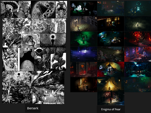
Berserk (Kentaro Miura, 1989) and Enigma of Fear (Dumativa, 2024) are more points of reference that are being used. Enigma of Fear (Dumativa, 2024) I've talked a lot about but again it's the core style that I'm trying to mimic. It's very similar to the HD-2D look with more modern looking environments, as opposed to it being a recreation of the classic 16 bit style in 3D. Berserk (Kentaro Miura, 1989) is being used primarily for the style for it's creatures and characters. The creature designs are really unique which fulfils the Eldritch Horror (Fantasy Flight Games, 2013) aspect of this game.

Both of the Octopath Traveler (Square Enix, 2018) games are primarily being used as support pieces of reference. This is not the core style but it can help with things like camera perspective and by how the battles look. The plan is to use this as a point of reference that can support the main points of reference.


To go along side of the reference I'll also be using the two renders I created along with the colour palette. These are tests in how well the style can be executed and they're also built in a way the reflects the overall vision of the game. The bottom render specifically shows this perfectly with it being in the Victorian style while abiding by the colour palette.

The paper prototype will remain as the core plan for the game. It's proven that this map does work in gameplay and I think that this should be really fun to play. The plan for this game is to make it a demo of sorts. So having this area be the core of the demo seems like a good idea.
Finally I've got the initial prototype for both the opening part of the level as well as a few gameplay mechanics. The level it's self (while incomplete) looks good and also is fun to play. On top of that the mechanics are also working really nicely also with everything working correctly without any issues. As mentioned before things like the camera clipping will be corrected before the start of the final project.
Conclusion
To conclude I'm both looking forward to this upcoming project but also a little worried. To start there's a possibility that this project doesn't even get the green light. Which would be really disappointing but that's the process. Also while I'm confident that this project can be achieved there's a chance that development problems cause this to not turn out as well as I was hoping. This is a small chance and hopefully I've got a team along side me that can help with these problems. I'll just have to wait till the project starts in the next few weeks.
Bibliography
Attilakozma (2023) Wooden Lamp Post Medieval Fantasy Lantern [Online Asset] Available at: https://sketchfab.com/3d-models/wooden-lamp-post-medieval-fantasy-lantern-7272ba80886d4d9d897d783c708adb2d (Accessed: 01/02/25)
Aurélien Martel (2017) After the rain... - VR & Sound [Online Asset] Available at: https://sketchfab.com/3d-models/after-the-rain-vr-sound-a1177381d3464f75b10cb8f462f0b9a5 (Accessed: 07/02/25)
Blizzard Entertainment (2016) Overwatch [Video Game] Blizzard Entertainment
CD Projekt RED (2020) Cyberpunk 2077 [Video Game] CD Projekt RED
Discover (2020) Victorian Street Lamp [Online Asset] Available at: https://sketchfab.com/3d-models/victorian-street-lamp-b7cebcfb4b1c4d4a97e22072800704ca (Accessed: 07/02/25)
Dumativa, Cellbit (2024) Enigma of Fear [Video Game] Dumativa, Nuuvem Inc
Extremely OK Games (2015) Pico 8 Celeste [Online Video Game] Available at: https://exok.com/minigames/celeste.html Extremely OK Games (Accessed: 11/12/24)
Fantasy Flight Games (2013) Eldritch Horror [Board Game] Fantasy Flight Games
Fextralife (2024) Bloodborne Wiki [Online] Available at: https://bloodborne.wiki.fextralife.com/Central+Yharnam (Accessed: 08/01/25)
Firewalk Studios (2024) Concord [Video Game] Sony Interactive Entertainment
FromSoftware Inc (2015) Bloodborne [Video Game] Sony Interactive Entertainment
FromSoftware Inc (2022) Elden Ring [Video Game] Bandai Namco
Game Freak (1996) Pokémon [Video Game] Nintendo
Game Freak (2022) Pokémon Legends: Arceus [Video Game] Nintendo
Havi Studio (2021) Procedural Fire [Online Asset] Available at: https://assetstore.unity.com/packages/vfx/particles/fire-explosions/procedural-fire-141496 [Accessed: 01/02/25]
Infinity Ward (2003) Call of Duty [Video Game] Activision
Irrational Games (2013) BioShock Infinite [Video Game] 2K
Josevega (2020) Dungeon Gateway [Online Asset] Available at: https://sketchfab.com/3d-models/dungeon-gateway-5a58a8821a5b47cda2710a8fe39751f7 [Accessed: 01/02/25]
Kentaro Miura (1989) Berserk [Manga Series] Young Animal Comics (JP), Dark Horse Comics (EN)
LocalThunk (2024) Balatro [Video Game] Playstack
NeoKG (2022 ) BSP Colossal Gothic Cathedral [Online Asset] Available at: https://sketchfab.com/3d-models/bsp-colossal-gothic-cathedral-4daa79636a6245908fc8b4bf44198d28 [Accessed: 01/02/25]
Nintendo (1993) The Legend of Zelda: Link's Awakening [Video Game] Nintendo
Nintendo (2006) Mother 3 [Video Game] Nintendo
Nintendo (2017) The Legend of Zelda: Breath of the Wild [Video Game] Nintendo
Nintendo (Never Released) Earthbound 64 [Video Game] Nintendo
Rare (2018) Sea of Thieves [Video Game] Xbox Game Studios
Retro Studios (2002) Metroid Prime [Video Game] Nintendo
Rocksteady Studios (2024) Suicide Squad: Kill The Justice League [Video Game] Warner Bros. Games
Rose-Engine (2022) Signalis [Video Game] Humble Games, PLAYISM
Securas (2019) EdgeNormals [Online Software Addon] Available at: https://github.com/securas/EdgeNormals (Accessed: 08/02/25)
Square Enix, Acquire (2018) Octopath Traveler [Video Game] Square Enix
Square Enix, Acquire (2023) Octopath Traveler II [Video Game] Square Enix
Square Enix / Square Soft (1997) Final Fantasy VII [Video Game] Square Enix / Square Soft
The Game Kitchen (2019) Blasphemous [Video Game] Team17
The Walt Disney Company (2025) Disneyland Park Anaheim, California Map [Online] Available at: https://disneyland.disney.go.com/destinations/ (Accessed: 11/12/24)
Wayforward (2019) River City Girls [Video Game] Arc System Works
Wayforward (2002) Shantae [Video Game] Capcom, Wayforward